Anaplan mobile app design system
Context
The idea of a mobile design system came about mainly from a consistency point of view. By the time I joined the team, the Anaplan mobile app had been live for a couple of years, and it was starting to show a lot of discrepancies between screens. Also, we, the mobile team, wanted to make it as easy as possible for other teams to be able to contribute to the mobile app. So we needed clear standards to share with the rest of the organisation. At the time, work was already ongoing to set up a design system for web. We planned to take their learnings, insights and style guide to create a design system explicitly for mobile.

Starting point
The first thing I started looking at was the typography. The web teams, who already had a design system, were using a typography hierarchy or more than 10 levels. This was necessary for web because of the wide range of content types that needed to be supported. But on mobile, even though we had mainly the same range of content, it would have been impractical to use such a deep hierarchy simply because there was a clear cut off for how large the font sizes could get due to space and how small they could get due to mobile accessibility guidelines. So to tackle this, I reduced the hierarchy levels to five. And I also carried out a mapping exercise to map the web typography hierarchy with the mobile version so that it was easy to repurpose web content into mobile content and vice-verser.
Mobile specific considerations
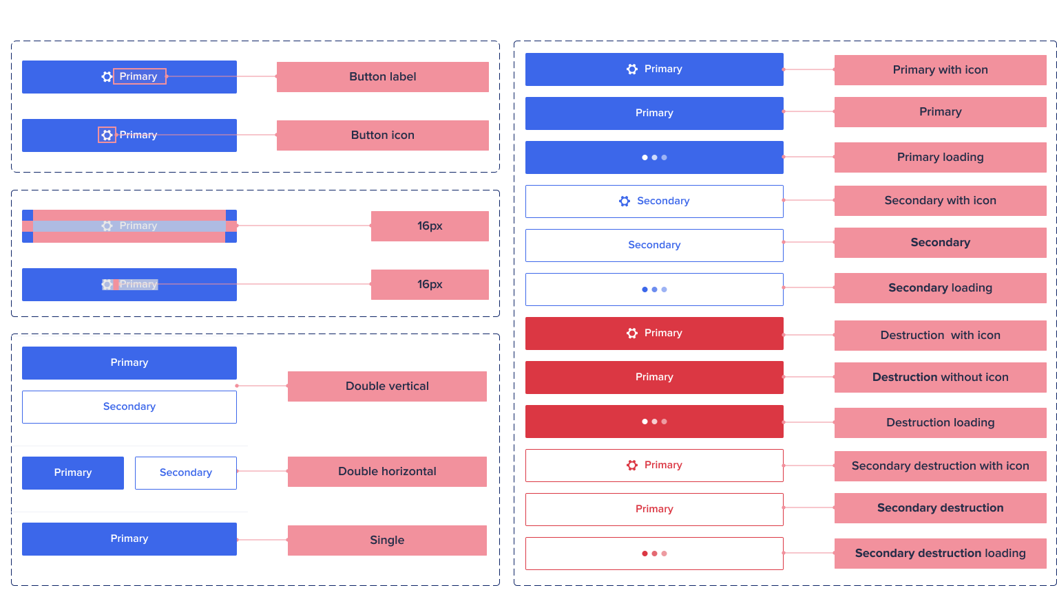
Working on the mobile design system, I put much effort into ensuring it remained consistent with web. But there were areas where I consciously decided to diverge because of mobile-specific usability issues.
The humble button was probably the most prominent component to be affected by this. On web buttons, width tends to be dictated by the text it holds. On mobile, it's slightly more complex. The ideal button should be reachable for both right-handed and left-handed users, so full-width buttons are preferable. But I also had to create rules for when not to use full-width buttons when the value of side-by-side buttons outweighed full-width buttons. For example, when we need to fix buttons at the bottom of the page and therefore need them to take as minimal space as possible.
There was also the use of disabled buttons. This was a heavily used pattern on web mainly because hover tooltips could be used to deal with inherited accessibility issues with disabled buttons. But mobile phones don't have hover capabilities, so I created rules that stopped the usage of disabled buttons on mobile and used feedback instead to indicate the inability to move forward.
It was also important to me to consider mobile-specific benefits as well as mobile-specific issues. A typical mobile phone has capabilities that can be hard to emulate on desktop, and I wanted to encourage anyone working on the Anaplan mobile app to make use of them. The camera and microphone are good examples of this, especially regarding data entry. So I ensured there were clear guidelines on how to use them in a way that could enhance the overall experience.
Conclusion
The initial work on the mobile design system took just under a month. But I never truly stopped working on it. For me, a good design system requires constant reviews and updates. That's the only way to ensure it remains fit for purpose. So I worked closely with developers and other designers to understand how the design system works for them and make necessary changes when it didn't work.