
The OVO Energy app
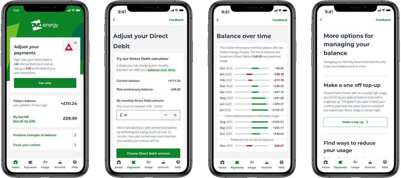
The OVO Energy app lets customers check their balance, see their bills and manage their monthly Direct Debit payment.
Who I worked with
I was the designer in the product squad. I worked with a product manager, a marketing lead, a brand lead and engineers to come up with and build ways to help customers understand how we calculate their payments.
Customers couldn’t see how usage affected their payments
Insight from several sources showed there was an issue with how OVO managed payments. When we investigated the root cause, we found that customers simply didn’t understand the relationship between their energy usage and their Direct Debit payment.
The goal was to give better context to customers we had identified as being at risk of ending up in debt. We measured success with two metrics:
-
Increase the percentage of customers who took action after being told about their debt risk.
-
Decrease the percentage of customers who complained about our debt risk assessment.
How I approached the problem
-
Step 01
Review research
Made the most of existing research about payments and usage, as primary research was harder during the coronavirus pandemic.
-
Step 02
Sketching session
Hosted a sketching session with the squad, using insights from the research to come up with solutions.
-
Step 03
Competitor analysis
Mapped the payment journeys of every major UK energy supplier, and analysed their pain points and delighters.
-
Step 04
Design and test
Designed the initial journey and ran a round of guerrilla user testing to check my hypothesis.
-
Step 05
Stress-test with real data
Tested the designs against real customer data with engineers, and replaced the slider with a counter.
-
Step 06
Finalise and measure
Worked with the copy and brand team on the final designs, and with the product manager on analytics tracking.
Three things shaped the design
A project I started, with no back-end support
This project was initiated entirely by me. Because of that, there was no resource to make any back-end changes. So everything had to be built using only our existing APIs and the information customers could already see.
That constraint shaped the whole design. Instead of new data, the experience brings together what already existed in one place: a warning on the home screen, a view of the balance and Direct Debit, a chart of the balance over time, and options for managing it.
Research during a pandemic
The coronavirus pandemic made primary research much harder than usual. Instead, I made the most of research about payments and usage that had already been carried out. Using insights from those reports, I hosted a sketching session with the rest of the squad to come up with solutions to the problems customers were facing.
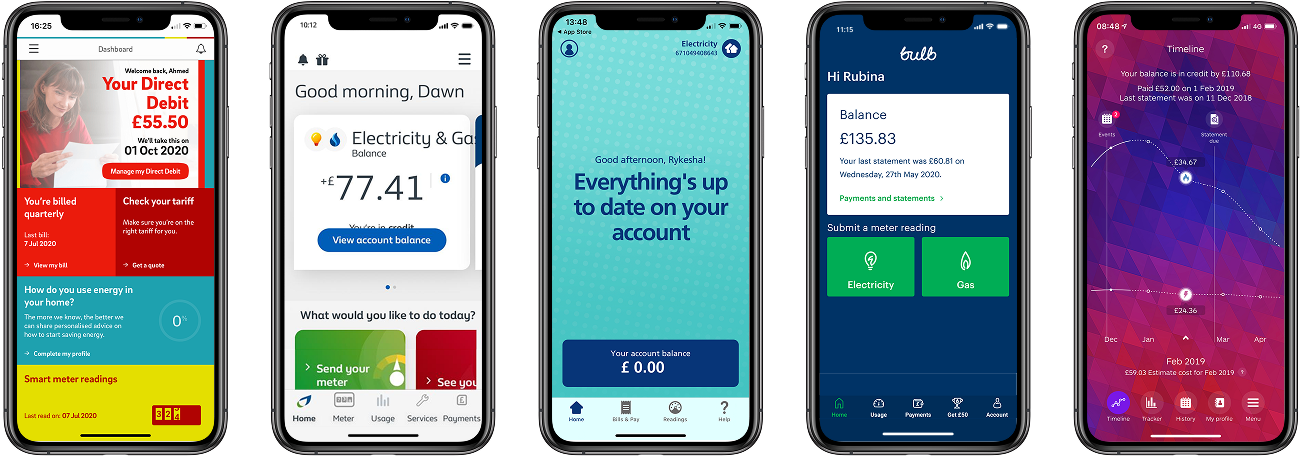
I also wanted to know what our competitors were doing to solve the same problem. I found friends and family who were customers of every major energy supplier in the UK, mapped out their digital experiences, and analysed the pain points and delighters of their payment journeys.
Designing for real data
After a round of guerrilla user testing, my hypothesis held up. Users understood the impact of their payments and felt encouraged to take action sooner.
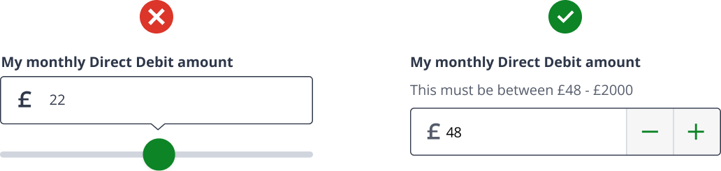
But when I stress-tested the designs with the engineers using real data, it became clear that the slider at the heart of the initial designs wasn’t suitable. Real Direct Debit ranges varied too much: a range of £20 to £200 was too wide to control, and £20 to £25 was too narrow to be worth sliding.
I replaced the slider with a counter. It wasn’t as flexible, but it gave customers much more control while still letting them explore. My decision took into account:
-
The strain on the customer’s hand when using the counter.
-
How close the counter sat to the parts of the screen it affected.
-
The existing design style guide.
Fewer billing calls to customer service
After the feature launched, customer service calls about billing dropped considerably among customers who had downloaded the app.
I worked with the product manager on analytics tracking, and added in-app feedback so customers could rate the new journey.
Guerrilla testing, done right, can be as powerful as formal testing
The pandemic ruled out the formal research I would normally plan. So I turned to guerrilla testing, which was quick, cheap and easy to fit around the squad's work. It still gave us the answer we needed: customers understood how their payments worked and felt encouraged to act sooner.
What made it work was treating it with the same rigour as a formal study. I went in with a clear hypothesis, tested with people who matched the customers we were designing for, and knew what I needed to learn before each session.