
Visualising planning data on maps
Context
Anaplan is a planning tool for large businesses. Businesses use it to build pages that visualise data from their models. Decision makers then use these pages to review the data and make decisions.
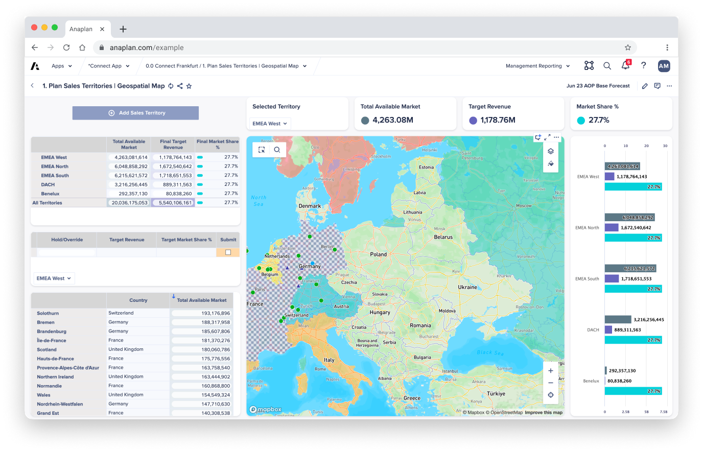
Research found that the existing ways of visualising data were limiting for geographical planning. So a project was launched to let businesses create data visualisations on top of maps. These could show key locations, areas of influence, supply chains and more.
Limitations
Creating and managing the maps wasn't part of this project. Instead, we relied on a third-party provider. As a result, we couldn't create a completely bespoke experience for our customers to build on. We had to work with the provider to find the best way to use their technology to meet our customers' needs.
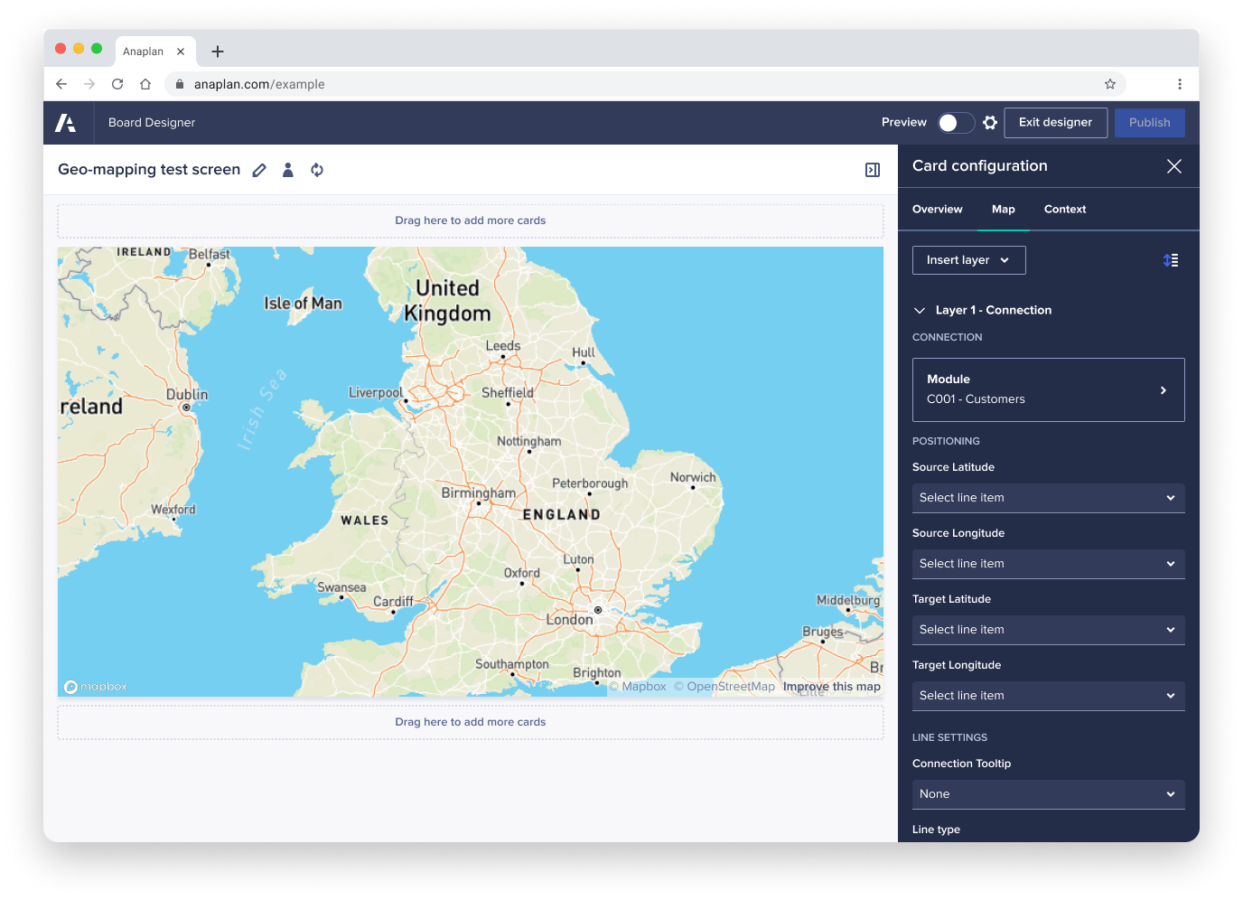
Anaplan lets customers use its tools to build almost anything they want. This made it extremely difficult to create a tool that would always produce something usable. Whatever we came up with, customers could still build something that was neither user-friendly nor accessible. Most of the time, these customers weren't designers.
Output
After extensive usability testing and refinement, we launched the feature. It led to a trackable increase in sales revenue to $180 million.
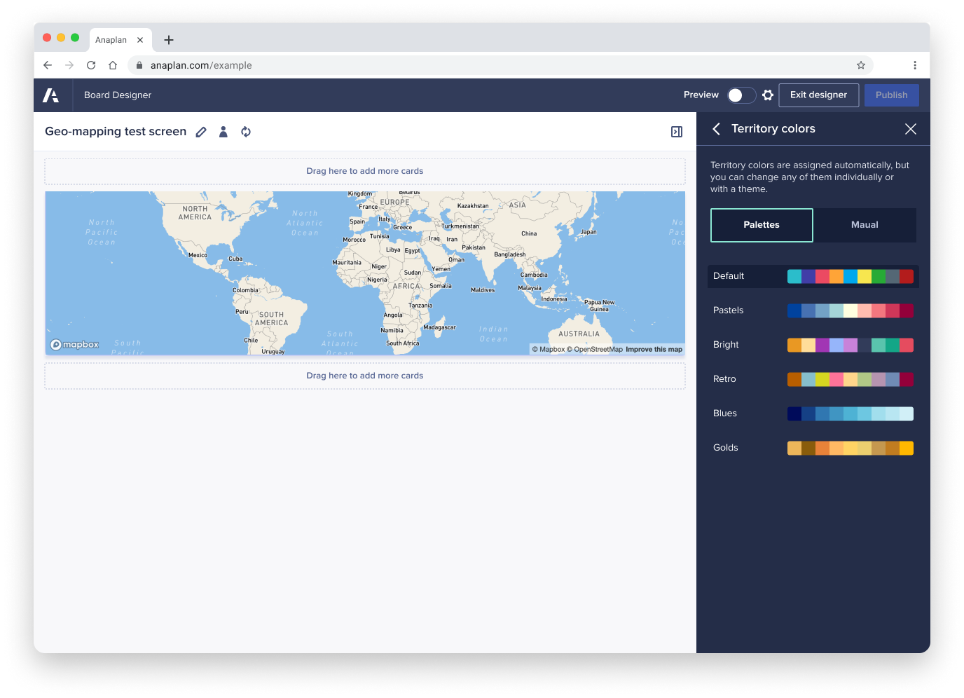
The project also highlighted other areas to focus on, such as a managed library of assets and colours that businesses can reuse. This led to further improvements to the system.