OVO Energy App home screen optimisation
Context
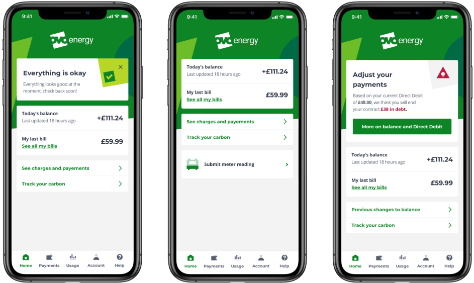
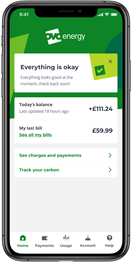
The agreed purpose of the app home screen was to either assure users that they have a healthy account is, or let them know what they can do to get back to a good state. But after a round of user testing, we discovered that customers found it overwhelming and it didn’t help them understand what was happening with their energy account.
Through that same research, we also learned that even though we were trying to explain the health of the account by making the transactions as clear as possible, our customers just didn’t know how the account balance worked and therefore didn’t know if their own balance was good or not.
Ideation for the new home screen
To guide decision making, I presented the following principles to stakeholders. The aim was to keep the conversation focused on observed user pain-points
1
There should be only one primary call-to-action (CTA)
This will make it clear to users what they should focus on
2
Focus on dynamic content
This will make the homescreen more engaging than content that hardly changes
3
Content should be relevant to the user
Different types of users care about different things and the home screen should reflect this
Output
With these three principles, I had sketching sessions with the product manager and other relevant stakeholders to establish what was the most salient information to show to customers as soon as they logged in. Once that was agreed, I worked with the brand team to also include the latest branding to the screen. I also specified the events and customer actions to track using our analytics tool to understand exactly how the changes would affect our overall metrics.